There's a particular kind of paralysis that strikes when you're standing in front of your record collection. Hundreds of albums, each one carefully chosen, and somehow you can't pick a single one to play. You pull out a record, second-guess yourself, slide it back. Try another. Repeat.
I needed something to decide for me.
Version 1: It Works, Ship It
The first version of Vinyl Roulette took maybe a weekend. I grabbed an off-the-shelf spinning wheel library, wired it up to the Discogs API to pull in my collection, and deployed it to my home server. Spin the wheel, get an album. Problem solved.
And it worked. The wheel spun. It picked albums. Technically, the job was done.
But every time I used it, something felt off. It looked like what it was: a developer tool. A proof of concept that never grew up. The kind of thing you'd show someone with a disclaimer—"I know it looks rough, but trust me, it's useful."
I used it anyway. It sat on my home server for months, doing exactly what I built it to do. That should've been enough.
The Shift: Seeing Through Someone Else's Eyes
At some point, I started thinking about other vinyl collectors. People with the same decision paralysis, the same overwhelming shelves. They might actually want something like this.
So I looked at my app—really looked at it—and asked myself: would I share this with someone?
The answer was no. Not because it didn't work, but because it didn't feel like anything. It was functional but forgettable. A wheel that spun. Nothing more.
If I was going to share this with other people, it needed to feel like something you'd actually want to use. Not just functional—delightful.
Throwing Away the Library
The off-the-shelf wheel had to go.
It wasn't bad. It did what it promised. But it couldn't become what I was starting to imagine: something that felt like a real turntable. The library gave me a wheel. I wanted vinyl.
So I started over with HTML5 Canvas—a blank slate with terrifying freedom. No constraints, no guardrails, no pre-built components. Just pixels and math.
It was humbling. It was also exactly what I needed.
Making It Real: The Design Obsession
What followed was months of obsessive detail work. Each piece of the turntable became its own project.
The Vinyl Record
A real vinyl record isn't just a black disc. Look closely and you'll see concentric grooves with subtle gaps between tracks. Light catches differently across the surface.
I added concentric circles with varying spacing—tight grooves with larger gaps to simulate track separations. Subtle radial lines create depth when the record spins. A gradient overlay gives the illusion of 3D lighting, brighter near the center and darker at the edges.
The tonearm came next—pivot housing, counterweight, headshell, cartridge, even the tiny colored wires that connect the pins. A dark red stylus with a bright tip. When you spin the wheel, the arm swings down to hover over the record. When you're done, it lifts back up.
At this point, I was content. The wheel looked like a vinyl record. The tonearm added character. I was ready to call it done.
"Something's Missing"
But just as I was about to ship it, something nagged at me. The UI felt... empty. The turntable looked good, but it didn't look complete.
So I did what any reasonable person would do: I started browsing photos of real record players. The Audio-Technica AT-LP70X caught my eye (I don't own one, but Audio-Technica, if you're reading this, I'm very open to sponsorships). What struck me wasn't just the platter or the tonearm—it was the control panel. START. STOP. SPEED. Simple, physical buttons that felt essential to the experience.
I needed those buttons.
Adding them was easy. Making them right was not.
See, at this point in the project, cosmetic buttons weren't an option anymore. I'd spent weeks making the vinyl look real. I'd animated a tonearm. I couldn't just slap on some flat circles and call them buttons. They had to look good. They had to work. And most importantly, their interaction had to feel natural to vinyl lovers—the same intuitive experience as walking up to a real player and pressing START.
So the buttons became 3D spheres with radial gradients—brighter where light would hit, darker at the edges. When you press one, it moves down two pixels. Your brain registers the tactile feedback even on a flat screen. The speed indicator lights glow orange when active, dark when waiting. START begins a continuous spin at your chosen RPM. STOP gradually slows the platter and selects whatever album it lands on.
It's not just decoration. It's how a turntable works.
The Gap Between "Works" and "Finished"
Here's what surprised me: the technical effort between V1 and the final version wasn't dramatically different. Both fetch data from an API. Both render a wheel. Both let you spin and select.
What changed was intentionality.
V1 asked: "Does it work?" The final version asked: "Does it feel like something?"
The small details compound. Each one is invisible in isolation—you'd never consciously notice the gradient on a button or the spacing of the grooves. But together, they create a feeling. The difference between software you use and software you enjoy using.
I keep coming back to this thought: Nobody will notice each detail, but everyone notices when they're missing.
Try It Yourself
Vinyl Roulette is live at ekchinhui.github.io/vinyl-roulette. Connect your Discogs username (your collection needs to be public), and you'll see your records appear on the wheel. If you don't own any vinyl, feel free to browse my humble collection instead.
If you've ever stood paralyzed in front of your shelves, maybe this will help.
And if you're a developer thinking about polishing that side project you've been sitting on—the one that works but feels rough—maybe this is your sign. The details matter more than you think.
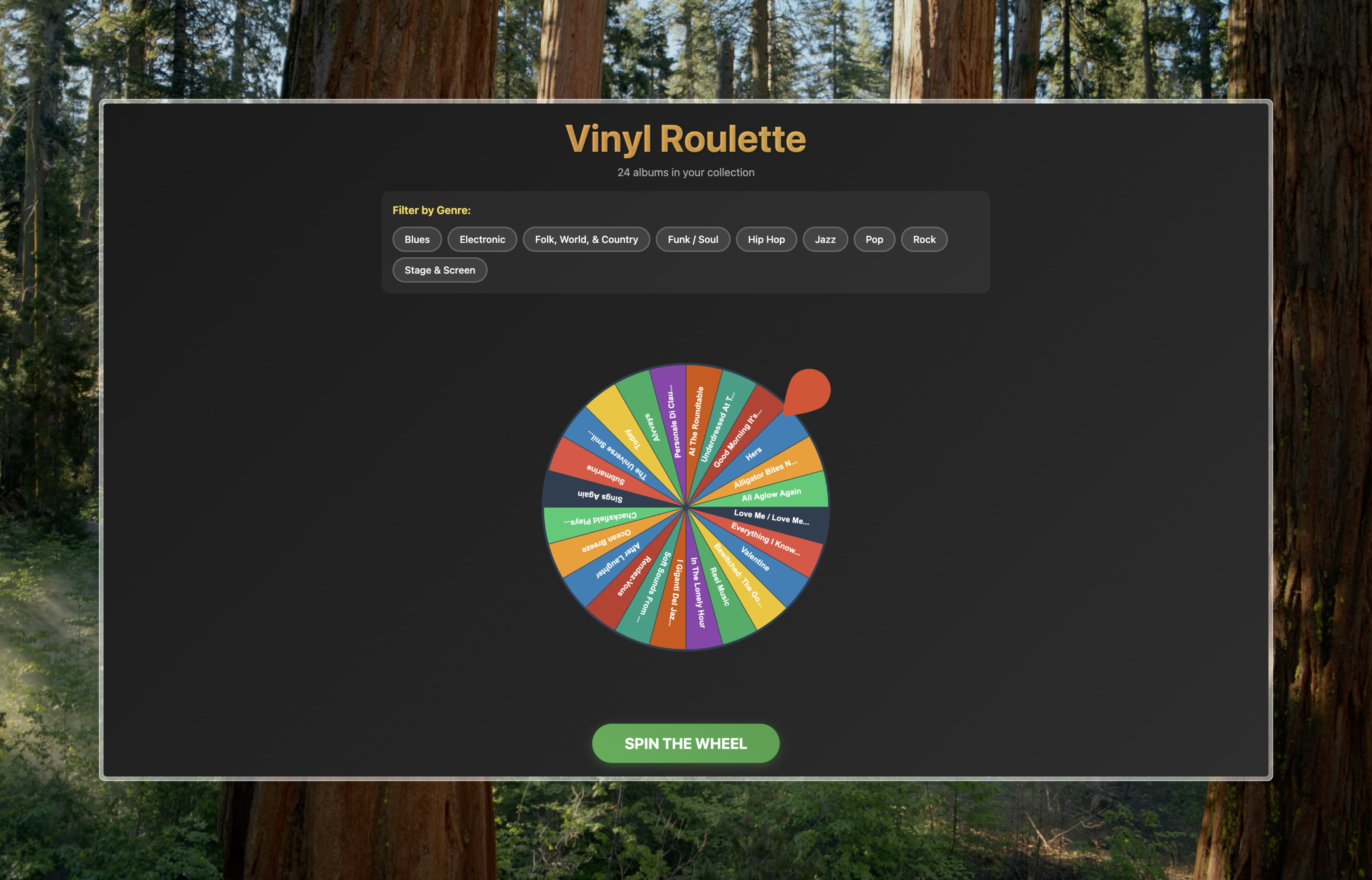 Before: The off-the-shelf wheel library
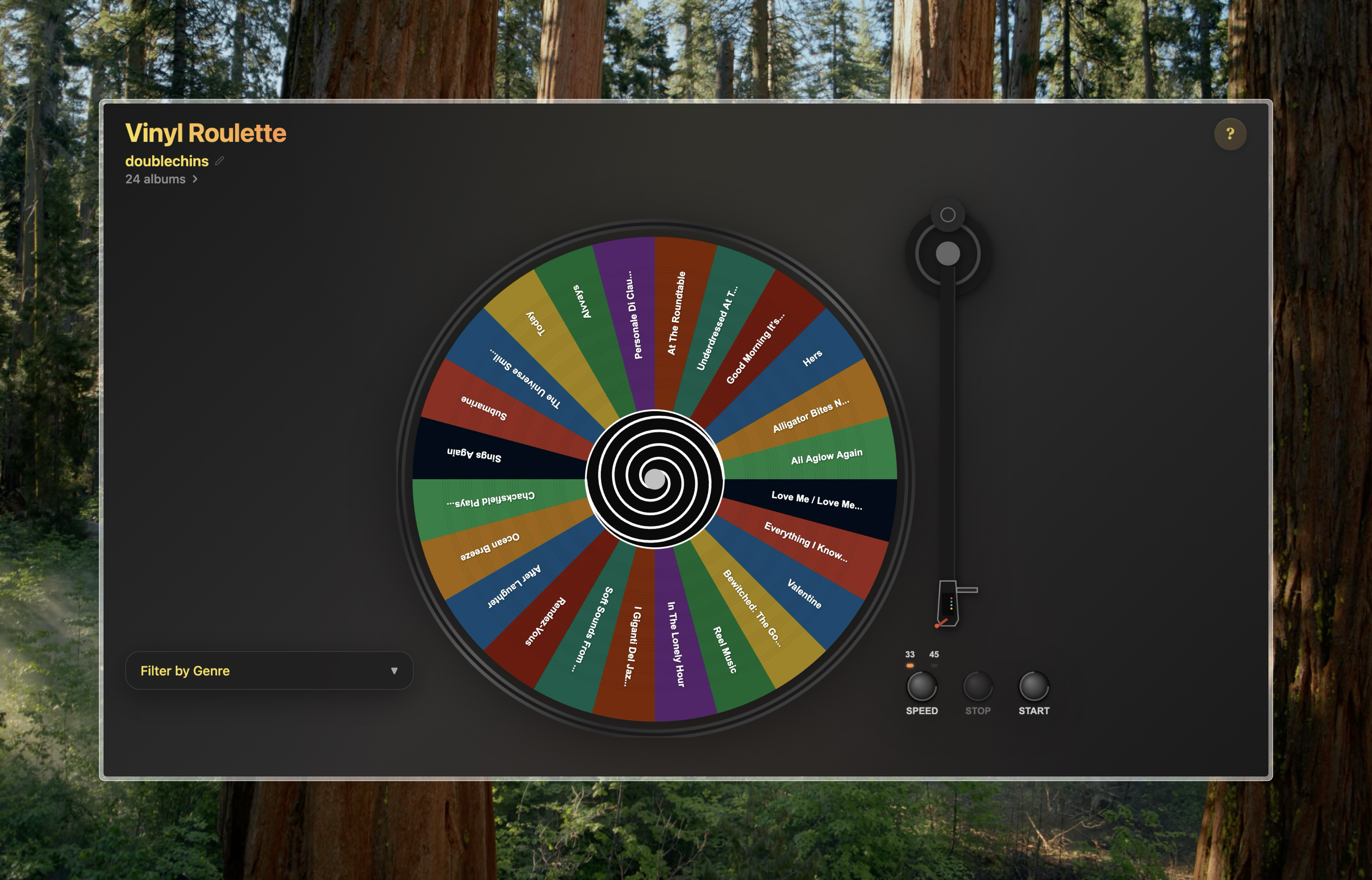 After: The handcrafted turntable
Built with React, TypeScript, and way too many hours staring at Canvas documentation.